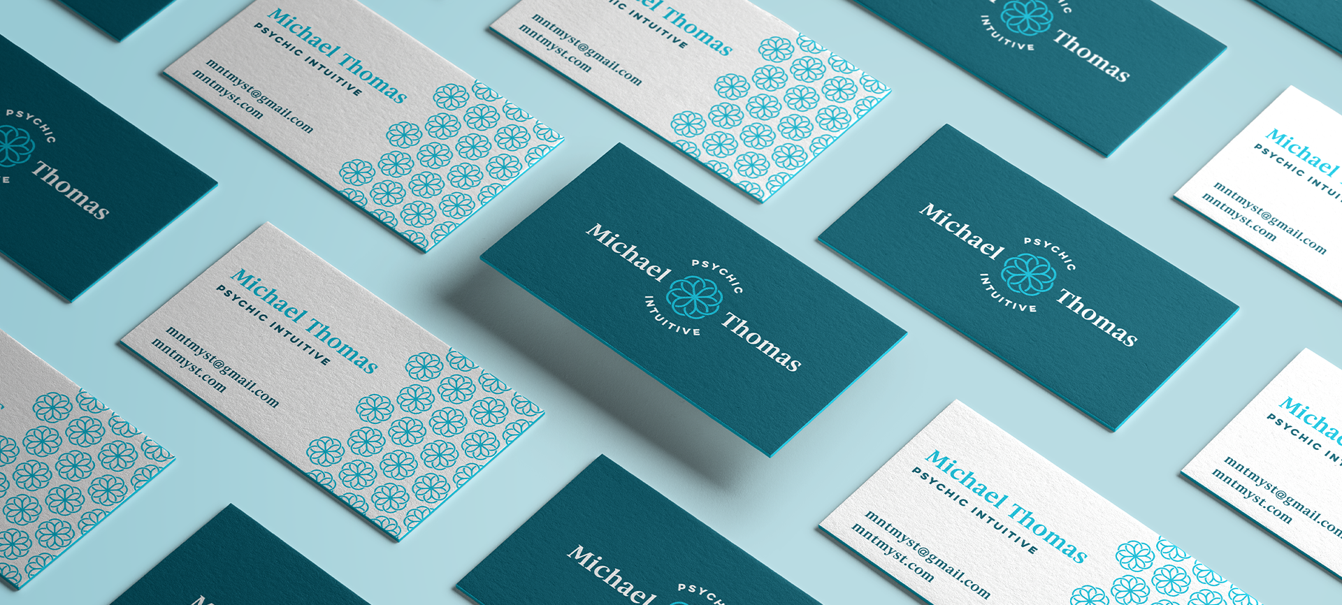
Michael Thomas, a psychic intuitive located in Asheville, NC, contacted me about expanding his business and his need for graphics. This one is a fun story. A few months beforehand I had an idea for a symbol, created it and kept it in a special file not knowing what I would use it for quite yet.
The symbol represents multiple things: a flower, interlocking good luck clovers, sacred geometry, forward movement, third eye, etc. These are all things that represent Michael and that is how I knew the symbol was always meant to be his. Michael is an unexpected treasure. Anyone who has had a session with him would easily say he is truly one of the kindest and most caring people walking this earth.
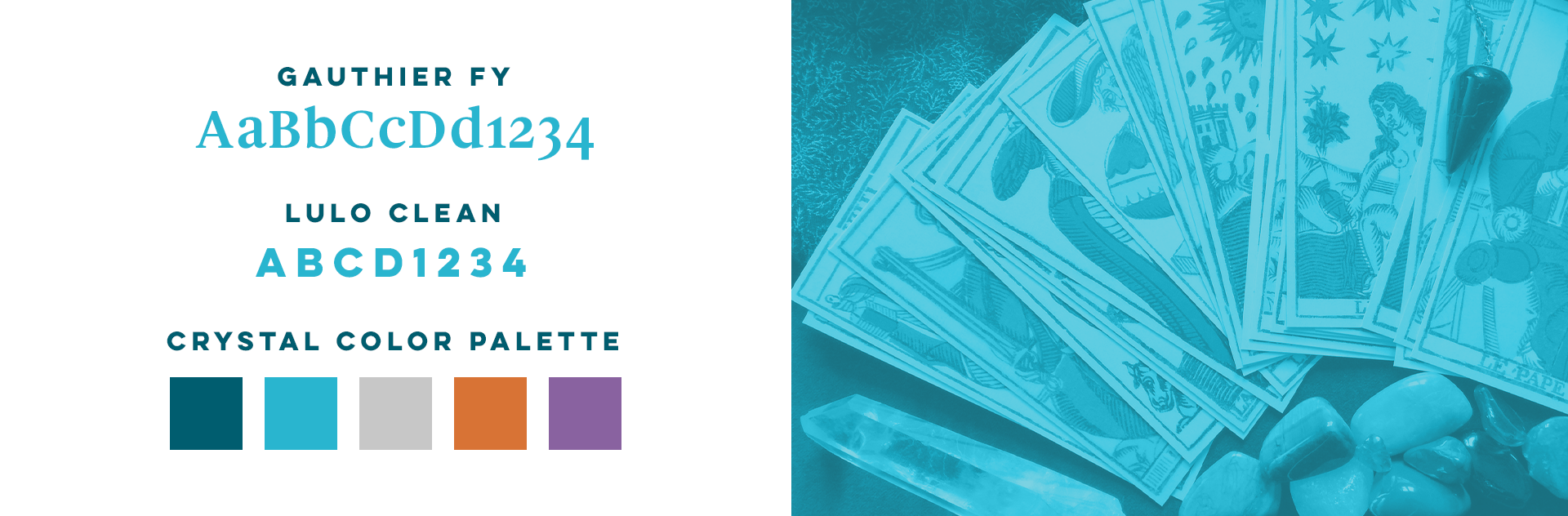
Choosing the typeface and color palette was very important. There are mixed thoughts when someone hears the word “psychic” and the emotion behind his branding needed to be genuine, calm, and professional. Teal was chosen as his primary color because it is considered to be rejuvenating, representing open communication and clarity of thought.