
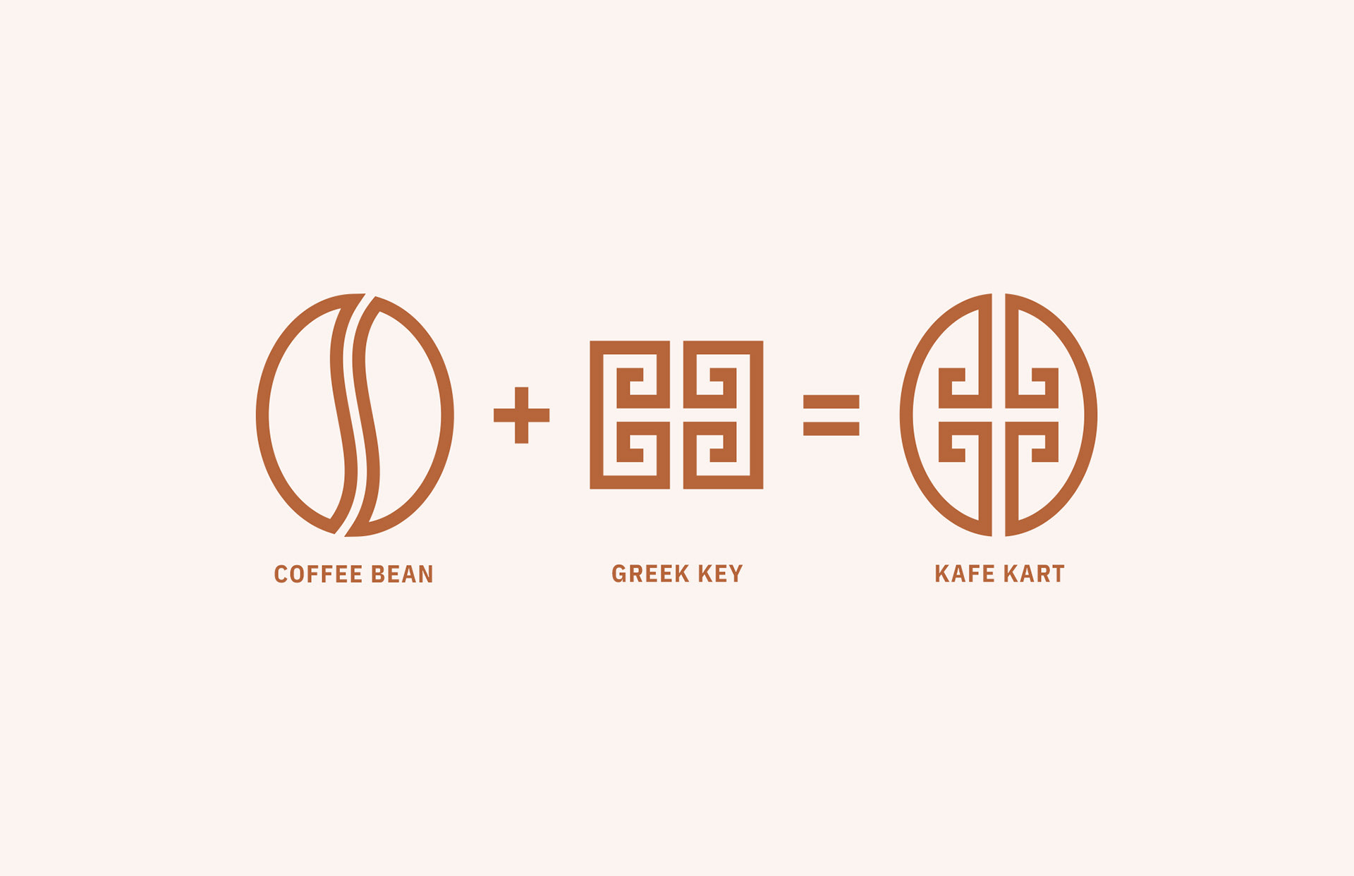
Kafe Kart, a mobile coffee bar, approached me about creating an iconic logo for their new brand. It was important for the logo to accomplish a few things: Greek culture, a color palette to match their existing cart, and a mark bold enough to be visible from a distance. The Kafe Kart mark, which translates to coffee bean in Greek, is the result of a coffee bean paired with a greek meander (better known as a Greek key).
Scope:
– Logo System
– Typography & Color Palette
– Brand Guidelines
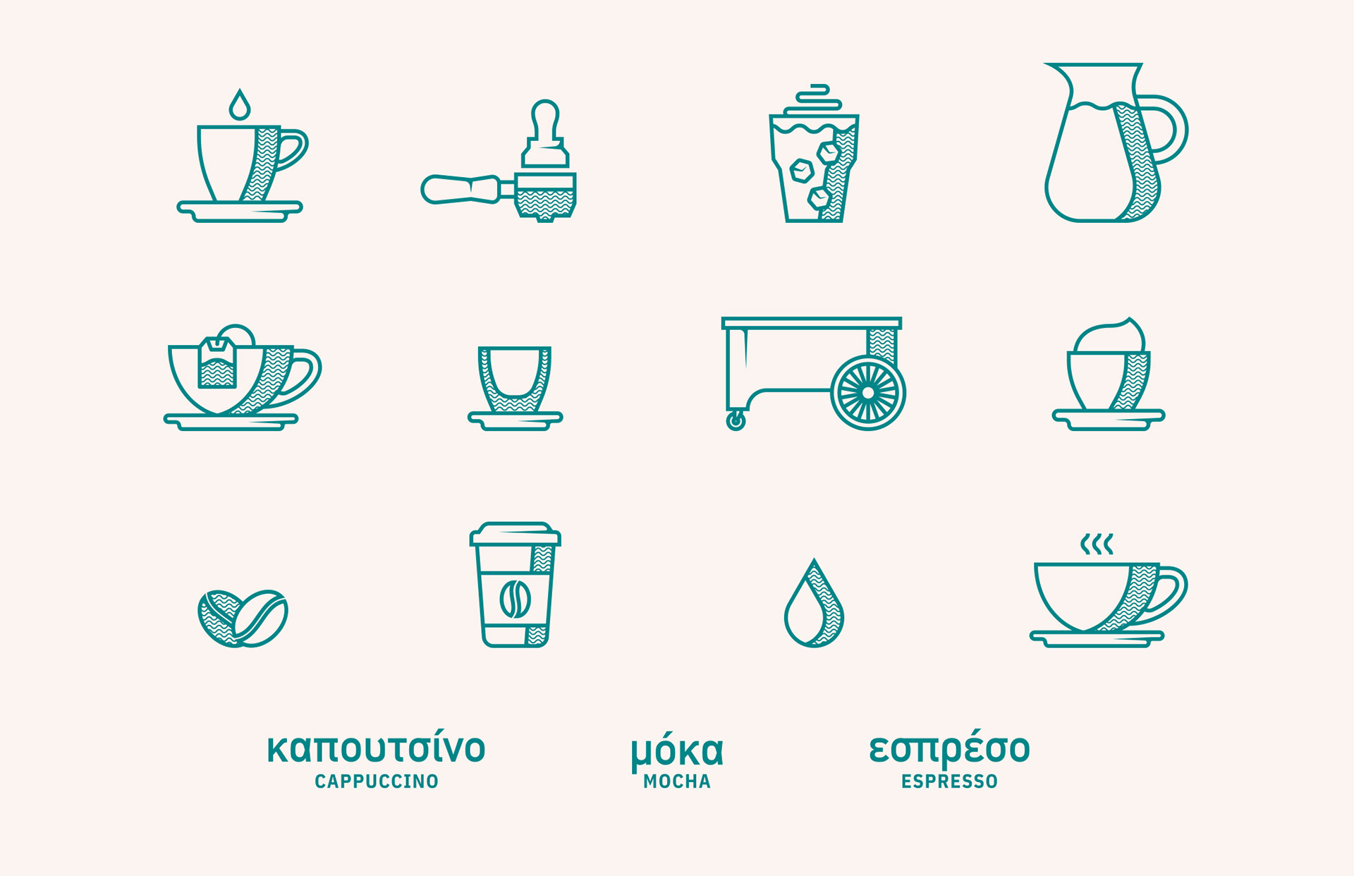
– Iconography
– Cart Wrap
– Packaging
– Logo System
– Typography & Color Palette
– Brand Guidelines
– Iconography
– Cart Wrap
– Packaging
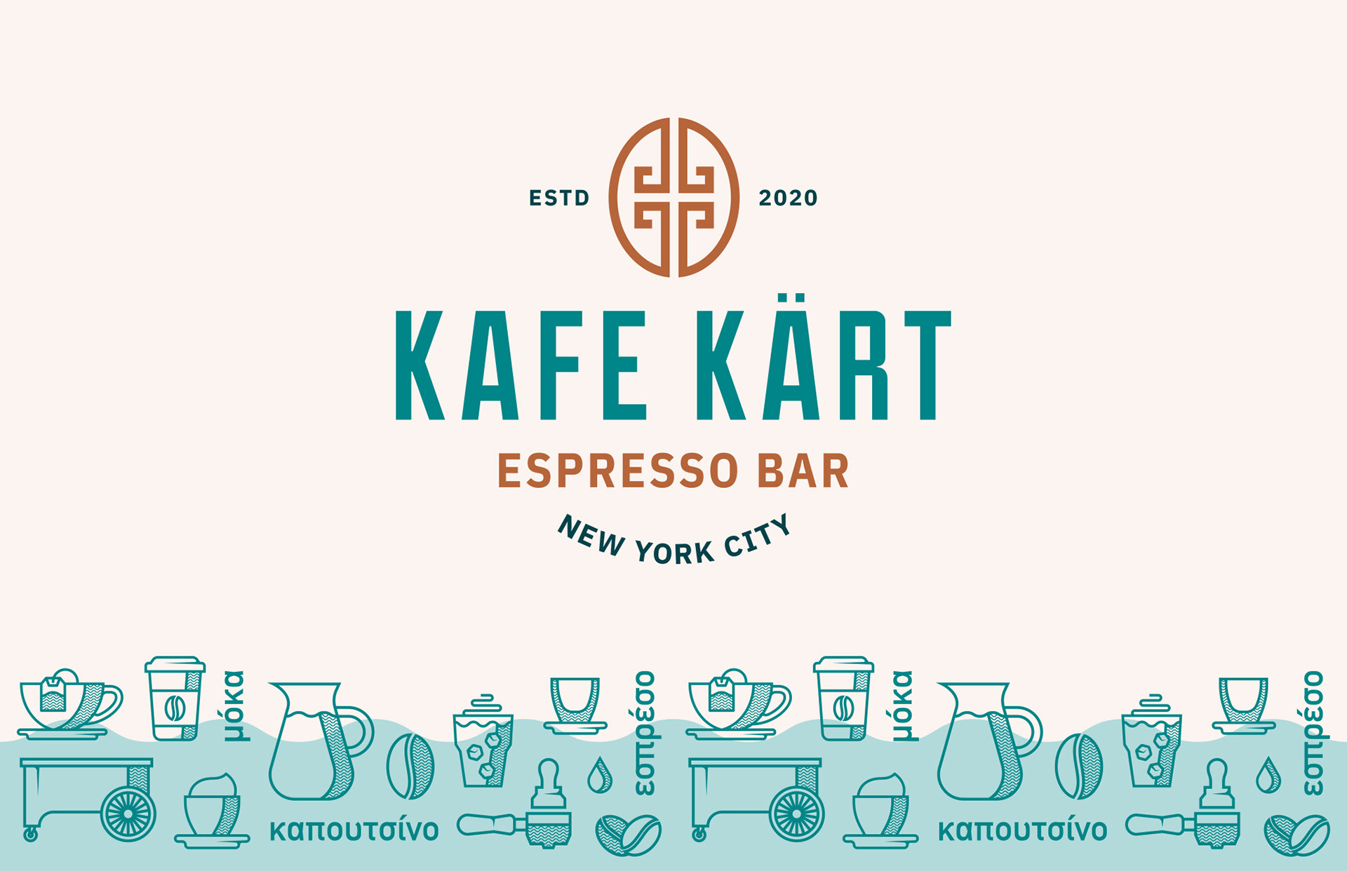

Once the logo was complete, I had the opportunity to explore how the brand would look when it came to iconography, extended color palette, and graphic elements. Imagining the view while sitting outside of a coffee shop in Greece, I kept going back to the idea of the beautiful beaches, waves and textures that one might see. With that in mind, a simple wave became a staple graphic element for Kafe Kart, not only as a background accent but also the texture inside of the icons.
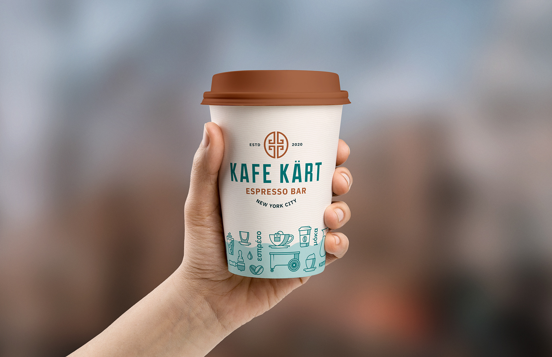
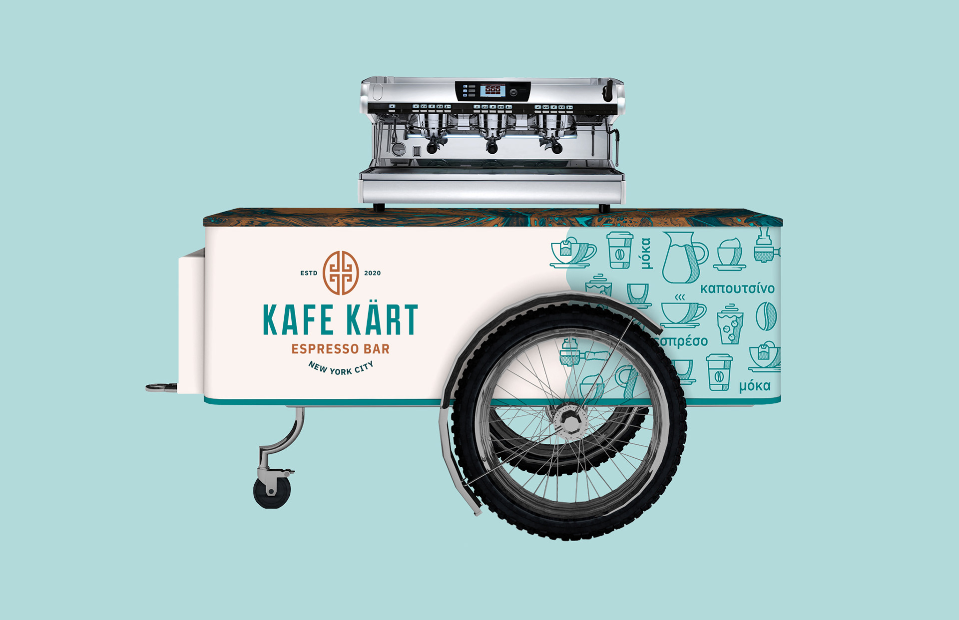
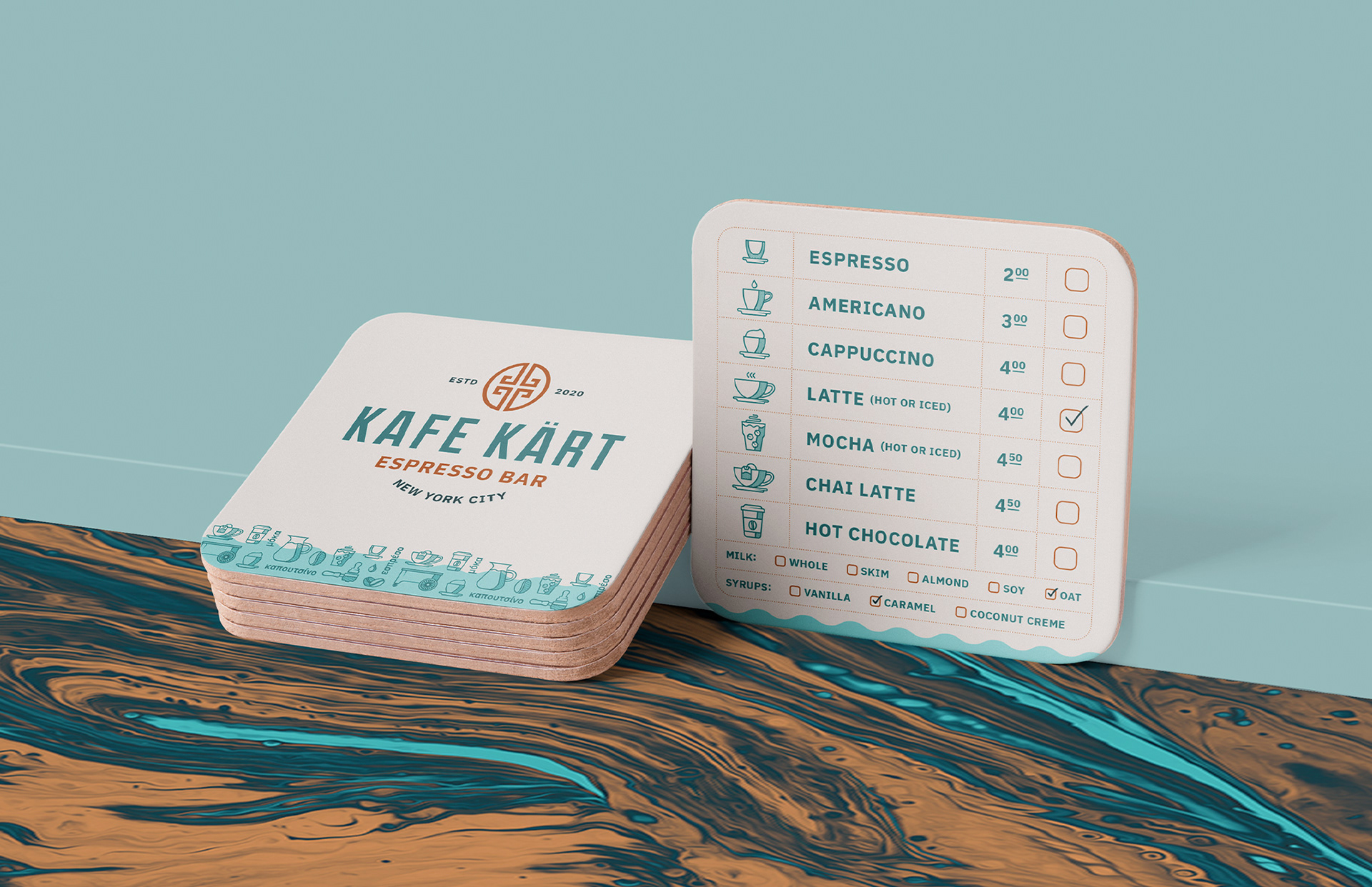
This Greek influenced branding then all paired beautifully together to create their cart wrap, coasters that also double as a menu and a coffee cup design. Next for Kafe Kart will be packaging for their own coffee beans, brand guidelines, promotional items and more!